7.4. Custom Designer Widgets#
Beside QtDesginer-Widgets for plots and figures (see Plots and Figures) some further designer plugin widgets have been develop to enable access to useful or itom specific objects and functions in individual GUIs.
These widgets can be used like any other type of widget within an ui-dialog with two exceptions:
The user interface in terms of an ui-file must be loaded and initialized within an itom-python context (e.g. script in itom).
Some properties are not accessible in the QtDesigner (e.g. actuator-handles or dataObjects) and must be set or read in the script. (They are marked with DESIGNABLE false in the Q_PROPERTY macro in their header file).
To add such a widget to your ui-file, you can drag&drop them in the QtDesigner like any other widget.
The following sub-sections give an overview about some additional itom widgets:
7.4.1. DataObjectTable#
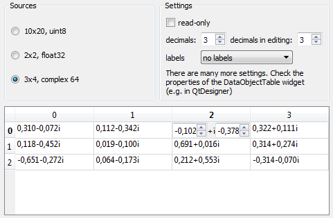
The designer plugin DataObjectTable is used to display a dataObject in
an user interface as a table. The displayed content of a dataObject is thereby a shallow copy.
If the read-only property of the table is not set, the user can modify the content which leads
to a direct modification of the values in the origin object. It is not possible to change the
size or type of the displayed dataObject.

The figure is taken from the example dataObjectTableDemo (demo subfolder ui/customItomWidgets). In this example, the dataObjectTable widget has the object name table. You can then assign an arbitrary data object to the widget using the following code snippet:
myGui.table["data"] = dataObject.randN([3,4], 'complex64')
Vice-versa, the current dataObject is also obtained by the property data.
7.4.1.1. Properties#
The widget dataObjectTable has many options for the parameterization. The entire list can be obtained using the
method info(). Most properties can be directly changed in the QtDesigner editor. Only the data
property is only accessible via the script.
The following properties are often used properties of dataObjectTable:
- alternatingRowColors{bool}
if true, the background of rows is alternated (e.g. between white and grey)
- readOnly{bool}
enable write protection
- min{float}
minimum acceptable value (if editing is allowed)
- max{float}
maximum acceptable value (if editing is allowed)
- alignment{enumeration: int or str}
changes the alignment of the text cells (e.g. “AlignLeft”, “AlignCenter”, “AlignTop” - see Qt::Alignment)
- verticalResizeMode{enumeration: int or str}
defines the mode how the columns can be resized or are stretched over the available space (ResizeToContents, Interactive, Stretch, Fixed, Custom -> see QHeaderView::ResizeMode).
- horizontalResizeMode{seq. of str}
defines the mode how the rows can be resized or are stretched over the available space (ResizeToContents, Interactive, Stretch, Fixed, Custom -> see QHeaderView::ResizeMode).
- suffixes{seq. of str}
list with suffixes for each column. If less suffixes than columns are indicated, the last suffix is repeated.
- verticalLabels{seq. of str}
list with labels for each shown row (if more rows are shown than labels, a default numbering is used for additional rows)
- horizontalLabels{seq. of str}
list with labels for each shown column (if more columns are shown than labels, a default numbering is used for additional columns)
- defaultRows{int}
number of rows to be shown
- defaultCols{int}
number of column to be shown
- editorDecimals{int}
number of possible decimals during the edit of floating point numbers
- decimals{int}
number of visible decimals for floating point numbers
- data{dataObject}
dataObject that is displaye in the table view
7.4.1.2. Signals#
It is possible to connect to various signals emitted from the widget dataObjectTable. Most of them are derived
from the base classes and can for instance be requested using the method info() as member of the
instance of the widget (e.g. myGui.table.info(1)). Nevertheless, dataObjectTable comes with some specific
signals which can be used:
Besides the default signals from the base classes of the widget dataObjectTable, there are some more signals defined:
pressed(int,int) : signal emitted if a cell if the mouse is pressed on a cell. Arguments are (row,column) of the cell.
entered(int,int) : signal emitted if a cell is entered by the mouse cursor. Arguments are (row,column) of the cell. Property ‘mouseTracking’ needs to be enabled for this feature to work.
doubleClicked(int,int) : signal emitted if a cell is double clicked by the mouse. Arguments are (row,column) of the cell.
clicked(int,int) : signal emitted if a cell is clicked by the mouse. Arguments are (row,column) of the cell.
activated(int,int) : signal emitted if a cell is activated. Arguments are (row,column) of the cell.
In the following example, a python method is connected to the clicked signal such that the coordinates of the current cell all printed to the command line (see also example dataObjectTableDemo):
def cellClicked(row, column):
    print("cell clicked. row:" + str(row) + ", col:" + str(column))

myGui.table.connect("clicked(int,int)", cellClicked)
7.4.1.3. Copy the table to the clipboard#
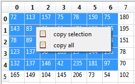
It is possible to copy a subpart or the entire table to the clipboard in a csv-ready format. In order to do this select a part or the entire table and choose copy selection or copy all from the context menu (right click on the table).

The result will look like this (copy selection):
72;113;157;75;78;150;75
143;83;98;99;170;128;175
78;89;111;138;73;193;194
123;137;56;189;15;144;136
132;137;146;42;235;181;97
7.4.2. Slider2D#
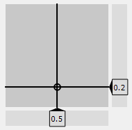
The designer plugin Slider2D shows a 2D slider panel, where you can choose a x- and y-value using the mouse. The demo script slider2DDemo in the demo subfolder ui/customItomWidgets shows an example. In the example, changes in any position and directly connected to two spin boxes, while changes in the spin box will call the setX or setY slot of the Slider2D. These connections are directly configured in the QtDesigner.

To manually change the x-value or y-value from a script, use the following snippet:
myGui.slider["xVal"] = 5
myGui.slider["yVal"] = 10.5
The value of one axis can be bound to a certain min/max value (using the xRange or yRange property). Additionally, an optional step size value can be adjusted. If it is bigger than zero, the step size based on the minimum value is automatically considered and values are rounded to the next possible value.
7.4.2.1. Properties#
The widget Slider2D has many options for the parameterization. The entire list can be obtained using the
method info(). Most properties can be directly changed in the QtDesigner editor.
The following properties are often used properties of Slider2D:
- decimals{int}
get/set the number of decimals
- yVal{float}
get/set current vertical value (y-value) of the slider
- xVal{float}
get/set current horizontal value (x-value) of the slider
- yStepSize{float}
get/set the step size of the y-value (default: 0.0, no step size constraints)
- xStepSize{float}
get/set the step size of the x-value (default: 0.0, no step size constraints)
- yRange{seq. of two floats}
get/set the range of the y-value
- xRange{seq. of two floats}
get/set the range of the x-value
7.4.2.2. Signals#
It is possible to connect to various signals emitted from the widget Slider2D:
valuesChanged(double,double) : signal is emitted if the hoirzontal and/or vertical value of the slider changed.
yValChanged(double) : signal is emitted if the y-value of the slider changed.
xValChanged(double) : signal is emitted if the x-value of the slider changed.
7.4.3. dObMetaDataTable#
The “dObMetaDataTable” can be used to visualize the metaData of a dataObject, e.g. to realize a measurement protocol. The widget is not inherited from a AbstractDObject and can not be used for a live plot.
7.4.3.1. Properties#
data: ito::DataObject, the dataObject to be shown, not accessible in QtDesigner.
readOnlyEnabled: bool, DESIGNABLE, enable write protection
detailedInfo: bool, DESIGNABLE, Toggle between basic and detailed metaData
previewEnabled: bool, DESIGNABLE, Add a small quadratic image downsampled from the dataObject as a preview to the meta data.
previewSize: int, DESIGNABLE, Set the preview size in pixels,
decimals: int, DESIGNABLE, number of decimals to be shown within each cell
colorBar: QString, DESIGNABLE, the name of the color bar for the preview, not implemented yet
7.4.4. EvaluateGeometricsFigure#
The evaluateGeomtrics-widget is designed to load geometric definition stored in a float32 dataObject with a column-size of >10 elements and a row for each geometric element to display. Further more it allows the evaluation of geometric relations between the geometric primitives. It contains a tableView and although is is inherited by AbstractDObject it should not be used for “liveVisualisation of dataObject”.
7.4.4.1. Properties#
title: QString, DESIGNABLE, Title of the plot or ‘<auto>’ if the title of the data object should be used. Not implemented yet valueUnit: QString, DESIGNABLE, The value unit for the metrical calculations that is used within the plot. titleFont: QFont, DESIGNABLE, Font for title. Not implemented yet labelFont: QFont, DESIGNABLE, Font for labels. Not implemented yet relations: ito::DataObject, Get or set N geometric elements via N x 11 dataObject of type float32. relationNames: QStringList, DESIGNABLE, A string list with the names of possible relation. The first elements [N.A., radius, angle to, distance to, intersection with, length and area] are read only and are calculated with these widget. For external calculated values you can define custom names e.g. roughness.. destinationFolder: QString, DESIGNABLE, Set a default export directory. lastAddedRelation: int, DESIGNABLE, Get the index of the last added relation. considerOnly2D: bool, DESIGNABLE, If true, only the x & y coordinates are considered.
7.4.4.2. Slots#
ito::RetVal addRelation(ito::DataObject importedData)
Add a relation to the current context. The relation must be
importedData, ito::DataObject: geometric element expressed by 1 x 4 dataObject of type float32.
ito::RetVal modifyRelation(const int idx, ito::DataObject relation)
Modify an existing relation addressed by the idx.
idx, int: Index of relation to modify
relation, ito::DataObject: geometric element expressed by 1 x 4 dataObject of type float32.
ito::RetVal addRelationName(const QString newName)
Add a new relation name to the relationNameList.
newName, QString: new relation name to be appended
ito::RetVal exportData(QString fileName, ito::uint8 exportFlag)
Export data to csv or xml
fileName, QString: Destination file name
exportFlag, int: Export flag, exportCSVTree = 0x00, exportCSVTable = 0x01, exportXMLTree = 0x02, exportCSVList = 0x03, showExportWindow = 0x10
ito::RetVal plotItemChanged(ito::int32 idx, ito::int32 flags, QVector<ito::float32> values)
Slot for direct connection between this widget and a plot (e.g. itom2dQwtPlot) to notify changes within the plotted geometry. Internal relations are automatically updated. External relation values (e.g. roughness) can not be updated automatically.
idx, int: Index of the modified geometric element
flags, int: Type (and meta properties) of geometric elements which was changed. If type differs from original type clear and refill is necessary.
values, QVector<ito::float32>: Geometric parameters of the modified geometric item.
ito::RetVal clearAll(void)
Clear all elements and relations in this plot.
7.4.4.3. Signals#
None
7.4.5. MotorController#
The “MotorController”-widget gives the user the some basic functions for generic motor positioning and position reporting within a complex GUI. The widget can be used for 1 to 6 axis and can be used readOnly or as a type of software control panel. The widget updated in a fixed interval (can be deactivated). During measurements the widget should be disabled to avoid user errors. A support for the 3DConnexion-Mouse is planned but Not implemented yet.
The motor should support up slot: RequestStatusAndPosition and signal: actuatorStatusChanged for semaphore free communication, but this is not necessary.
7.4.5.1. Properties#
actuator: ito::AddInActuator, Handle to the actuator to be used, not DESIGNABLE
numberOfAxis: int, DESIGNABLE, Number of axis to be visible
unit: QString, DESIGNABLE, Base unit for spinboxes and movements, e.g. nm, micron, mm, m, km
readOnly: bool, DESIGNABLE, Toggle read only
autoUpdate: bool, DESIGNABLE, Toggle automatic motorposition update
smallStep: double, DESIGNABLE, Distances for the small step button, same value for plus and minus
bigStep: double, DESIGNABLE, Distances for the large step button, same value for plus and minus
absRel: bool, DESIGNABLE, Toggle between absolute or relative position display. Origin can be set via context menu.
allowJoyStick: bool, DESIGNABLE, Allow a software joystick, e.g. usb or gameport, not implemented yet.
7.4.5.2. Slots#
void triggerActuatorStep(const int axisNo, const bool smallBig, const bool forward)
Trigger a step of axis axisNo with a distance either bigStep (true) or smallStep (false) and either forward (true) or backwards (false)
void actuatorStatusChanged(QVector<int> status, QVector<double> actPosition)
Internal slot for c++-Code connected to the corresponding signal of the actuator. Do not call this from python.
void triggerUpdatePosition(void)
Usually called by the internal timer, the context-menu or python to update the current motor position. Uses either Signal-/Slot-communication or invokes getPos blocking.
void guiChangedSmallStep(double value)
Internal slot if the small step size is changed within the GUI (spinbox)
void guiChangedLargeStep(double value)
Internal slot if the large step size is changed within the GUI (spinbox)
7.4.5.3. Signals#
void RequestStatusAndPosition(bool sendActPosition, bool sendTargetPos)
Internal signal for c++-Code connected to the corresponding slot of the actuator.
